Tidytuesday week 52
The Big Mac Index
This weeks topic is about the Big Mac Index.
How it works
Purchasing-power parity implies that exchange rates are determined by the value of goods that currencies can buy.
Differences in local prices - in our case, for Big Macs - can suggest what the exchange rate should be.
Using burgernomics, we can estimate how much one currency is under- or over-valued relative to another.
Pre-work
- Load necessary libraries,
- Set the ggplot2 theme to a type that is a bit more publication-ready.
# Attach libraries and functions
library(tidytuesdayR)
library(tidyverse)
library(patchwork)
library(ggforce)

# Set project theme
theme_set(theme_minimal() + theme(axis.line = element_line()))
Get the data
tuesdata <- tt_load(2020, week = 52)##
## Downloading file 1 of 1: `big-mac.csv`data_tt <- tuesdata$`big-mac`Take a look at the data structure.
skimr::skim(data_tt)| Name | data_tt |
| Number of rows | 1386 |
| Number of columns | 19 |
| _______________________ | |
| Column type frequency: | |
| character | 3 |
| Date | 1 |
| numeric | 15 |
| ________________________ | |
| Group variables | None |
Variable type: character
| skim_variable | n_missing | complete_rate | min | max | empty | n_unique | whitespace |
|---|---|---|---|---|---|---|---|
| iso_a3 | 0 | 1 | 3 | 3 | 0 | 56 | 0 |
| currency_code | 0 | 1 | 3 | 3 | 0 | 56 | 0 |
| name | 0 | 1 | 3 | 20 | 0 | 57 | 0 |
Variable type: Date
| skim_variable | n_missing | complete_rate | min | max | median | n_unique |
|---|---|---|---|---|---|---|
| date | 0 | 1 | 2000-04-01 | 2020-07-01 | 2013-07-01 | 33 |
Variable type: numeric
| skim_variable | n_missing | complete_rate | mean | sd | p0 | p25 | p50 | p75 | p100 | hist |
|---|---|---|---|---|---|---|---|---|---|---|
| local_price | 0 | 1.00 | 10043.23 | 181450.81 | 1.05 | 7.25 | 24.25 | 119.00 | 4000000.00 | ▇▁▁▁▁ |
| dollar_ex | 0 | 1.00 | 3817.91 | 69296.09 | 0.30 | 2.98 | 7.75 | 47.09 | 1600500.00 | ▇▁▁▁▁ |
| dollar_price | 0 | 1.00 | 3.26 | 1.26 | 0.64 | 2.34 | 3.04 | 4.01 | 8.31 | ▃▇▃▁▁ |
| usd_raw | 0 | 1.00 | -0.23 | 0.30 | -0.78 | -0.45 | -0.29 | -0.07 | 1.27 | ▆▇▂▁▁ |
| eur_raw | 0 | 1.00 | -0.23 | 0.27 | -0.81 | -0.44 | -0.28 | -0.07 | 0.87 | ▃▇▃▁▁ |
| gbp_raw | 0 | 1.00 | -0.18 | 0.30 | -0.81 | -0.40 | -0.23 | 0.00 | 1.14 | ▃▇▃▁▁ |
| jpy_raw | 0 | 1.00 | 0.04 | 0.39 | -0.72 | -0.26 | 0.00 | 0.23 | 2.16 | ▆▇▂▁▁ |
| cny_raw | 0 | 1.00 | 0.49 | 0.63 | -0.57 | 0.05 | 0.33 | 0.81 | 4.39 | ▇▅▁▁▁ |
| gdp_dollar | 684 | 0.51 | 25982.72 | 22811.59 | 1049.75 | 7989.72 | 15214.06 | 42221.24 | 100578.97 | ▇▂▃▁▁ |
| adj_price | 684 | 0.51 | 3.71 | 0.98 | 2.33 | 2.94 | 3.31 | 4.42 | 7.43 | ▇▃▃▁▁ |
| usd_adjusted | 684 | 0.51 | -0.02 | 0.26 | -0.58 | -0.18 | -0.03 | 0.10 | 1.49 | ▃▇▁▁▁ |
| eur_adjusted | 684 | 0.51 | -0.09 | 0.21 | -0.58 | -0.22 | -0.10 | 0.02 | 0.82 | ▂▇▅▁▁ |
| gbp_adjusted | 684 | 0.51 | 0.01 | 0.25 | -0.59 | -0.14 | 0.00 | 0.15 | 1.29 | ▂▇▂▁▁ |
| jpy_adjusted | 684 | 0.51 | 0.23 | 0.31 | -0.46 | 0.01 | 0.20 | 0.38 | 1.62 | ▂▇▃▁▁ |
| cny_adjusted | 684 | 0.51 | 0.03 | 0.26 | -0.56 | -0.13 | 0.02 | 0.15 | 1.41 | ▂▇▂▁▁ |
There are 1386 rows/observations and 19 columns/variables. The “adjusted” variables have a lot of missing entries.
Exploratory data analysis
For EDA, focus on Norway only (29 data points).
data_tt_norway <- data_tt %>% filter(name == "Norway")

# Number of data points for Norway
nrow(data_tt_norway)
## [1] 29Distributions
We will now plot a few of the variables to see their distribution.
Two variables are not related to Big Mac prices: dollar_ex (Local currency units per dollar, source: Thomson Reuters) and GDP_dollar (gross domestic product per person, in dollars, source: IMF World Economic Outlook reports). Let’s have a look at those first.
data_tt_norway %>%
  select(date, dollar_ex, gdp_dollar) %>%
  pivot_longer(-date) %>%
  ggplot(aes(date, value)) +
  facet_wrap(~ name, scales = "free_y") +
  geom_line()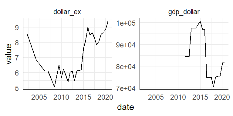
The data collection is more complete for dollar_ex. GDP_dollar starts at:
data_tt_norway %>%
  arrange(date) %>%
  filter(!is.na(gdp_dollar)) %>%
  slice(1) %>%
  pull("date")
## [1] "2011-07-01"…July 2011.
Let’s plot Norway over time. First look at local_price, dollar_price and adj_price.
data_tt_norway %>%
  select(date, ends_with("_price")) %>%
  pivot_longer(-date) %>%
  ggplot(aes(date, value)) +
  facet_wrap(~ fct_inorder(name), scales = "free_y") +
  geom_line()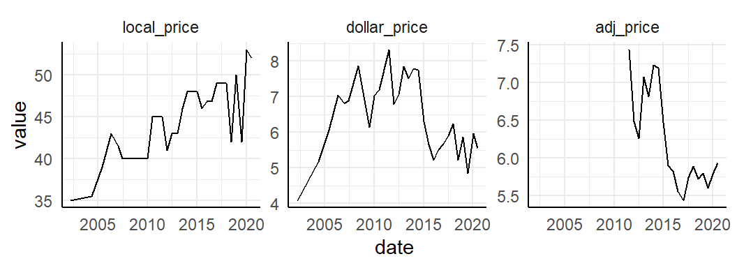
Then what about all the _raw variables? These variables are indices of under- or over-value of local currencies, compared to other currencies.
data_tt_norway %>%
  select(date, ends_with("_raw")) %>%
  pivot_longer(-date) %>%
  ggplot(aes(date, value)) +
  facet_wrap(~ fct_inorder(name), scales = "free_y", nrow = 1) +
  geom_line()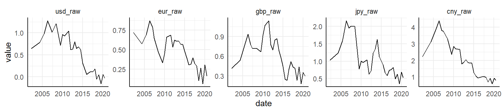
It appears the Norwegian krone has been over-valued for many decades compared to USD, EURO, BGP, JPY and CNY, but in recent years it has normalized somewhat. Let’s look at the same values, but adjusted for GDP.
data_tt_norway %>%
  select(date, ends_with("_adjusted")) %>%
  pivot_longer(-date) %>%
  ggplot(aes(date, value)) +
  facet_wrap(~ fct_inorder(name), scales = "free_y", nrow = 1) +
  geom_line()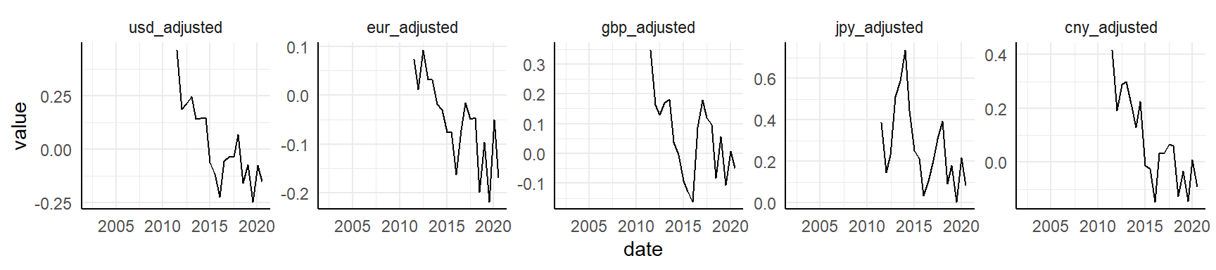
Same as above, except the time series is a bit shorter due to limits in GDP (available only from July 2011).
Highlight min and max values
If I want to highlight minimum and maximum values for a time series plot, I can just use filter directly. In the plot it will look like this:
data_tt_norway %>%
  ggplot(aes(date, local_price)) +
  geom_line() +
  geom_point(data = . %>% filter(local_price == max(local_price)), color = "blue") +
  geom_point(data = . %>% filter(local_price == min(local_price)), color = "red")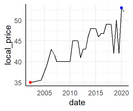
Trend line
We can also add a smoothened line to highlight the trend (instead of the variation) over time.
data_tt_norway %>%
  ggplot(aes(date, local_price)) +
  geom_line(color = "grey60") +
  geom_smooth(method = "lm", se = FALSE, color = "black", size = 0.5) +
  geom_point(data = . %>% filter(local_price == max(local_price)), color = "blue") +
  geom_point(data = . %>% filter(local_price == min(local_price)), color = "red")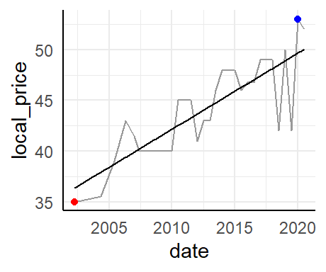
While the geom_line makes for nice-looking Tufte sparklines, the regression line can say something about trends. This could also have been shown as a smoothened line.
Burgernomics
Let’s move to burgernomics. We will now recreate a few of the figures from the Economics web tool.
All countries
Time series
Prep a few colors and start and end points in the time series.
col_values <- RColorBrewer::brewer.pal(n = 4, name = "Set1")[c(2, 1)]
date_start_end <- data_tt$date %>% unique() %>% magrittr::extract(c(1, 33))
Plot figure with points.
data_tt %>%
  mutate(value = if_else(usd_raw < 0, true = "under-valued", false = "over-valued")) %>%

  ggplot(aes(date, usd_raw, color = value)) +

  geom_hline(yintercept = 0, color = "grey80") +
  geom_line(data = . %>% filter(name == "Norway"), color = "grey60") +
  ggrepel::geom_text_repel(data = . %>% filter(name == "Norway" & date == "2011-07-01"),
                           aes(label = name), color = "grey60", size = 2.5) +
  geom_point(alpha = 0.2) +

  scale_color_manual(values = col_values) +
  scale_x_date(date_breaks = "2 years", date_labels = "%Y", limits = date_start_end) +
  scale_y_continuous(labels = scales::percent_format()) +

  theme_classic() +
  theme(legend.position = "none",
        axis.line = element_blank()) +

  labs(x = NULL, y = NULL)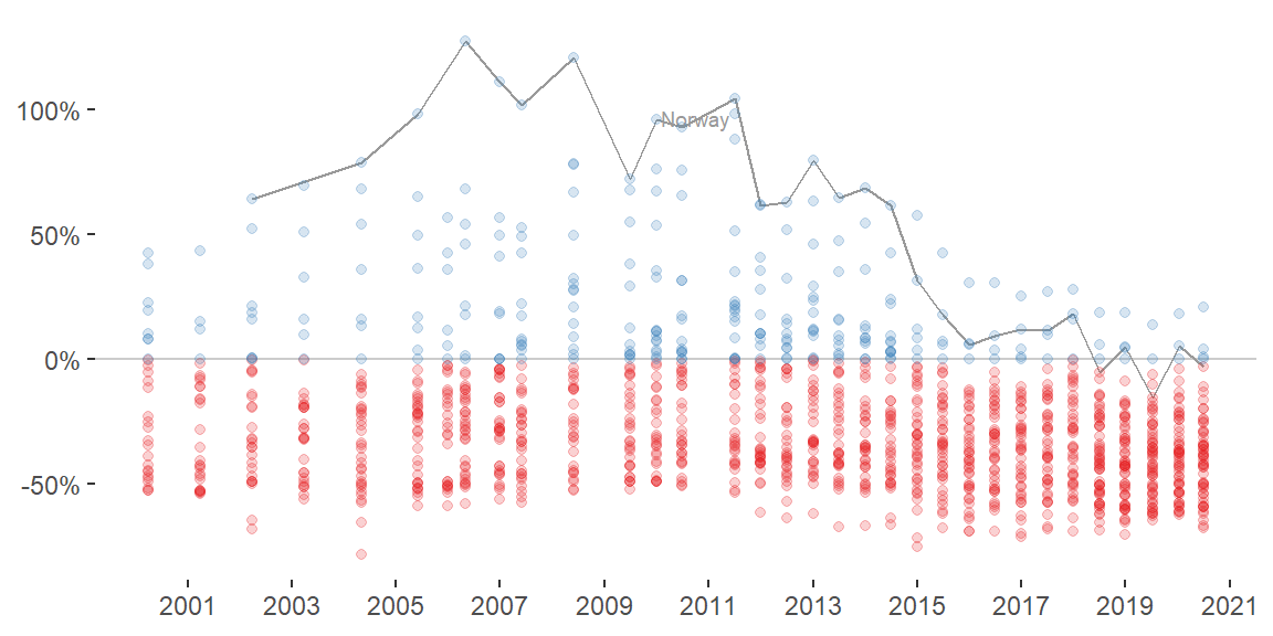
We see a general trend where the currencies tend to be more normalized or under-valued compared to USD over time.
Switch to another geom to emphasize the trend for each country. Include trends for both raw and GDP-adjusted values for all currencies.
data_tt %>%
  pivot_longer(c(ends_with("_raw"), ends_with("_adjusted")), names_to = "raw_adjusted") %>%

  ggplot(aes(date, value)) +

  geom_hline(yintercept = 0, color = "grey80") +
  geom_line(aes(group = name), alpha = 0.1) +
  geom_smooth(size = 0.5) +

  scale_color_manual(values = col_values) +
  scale_x_date(date_breaks = "6 years", date_labels = "%Y") +
  scale_y_continuous(labels = scales::percent_format()) +

  facet_wrap(~ fct_inorder(raw_adjusted), nrow = 2) +
  theme_classic() +
  theme(legend.position = "none",
        axis.line = element_blank(),
        strip.background = element_blank()) +

  labs(x = NULL, y = NULL)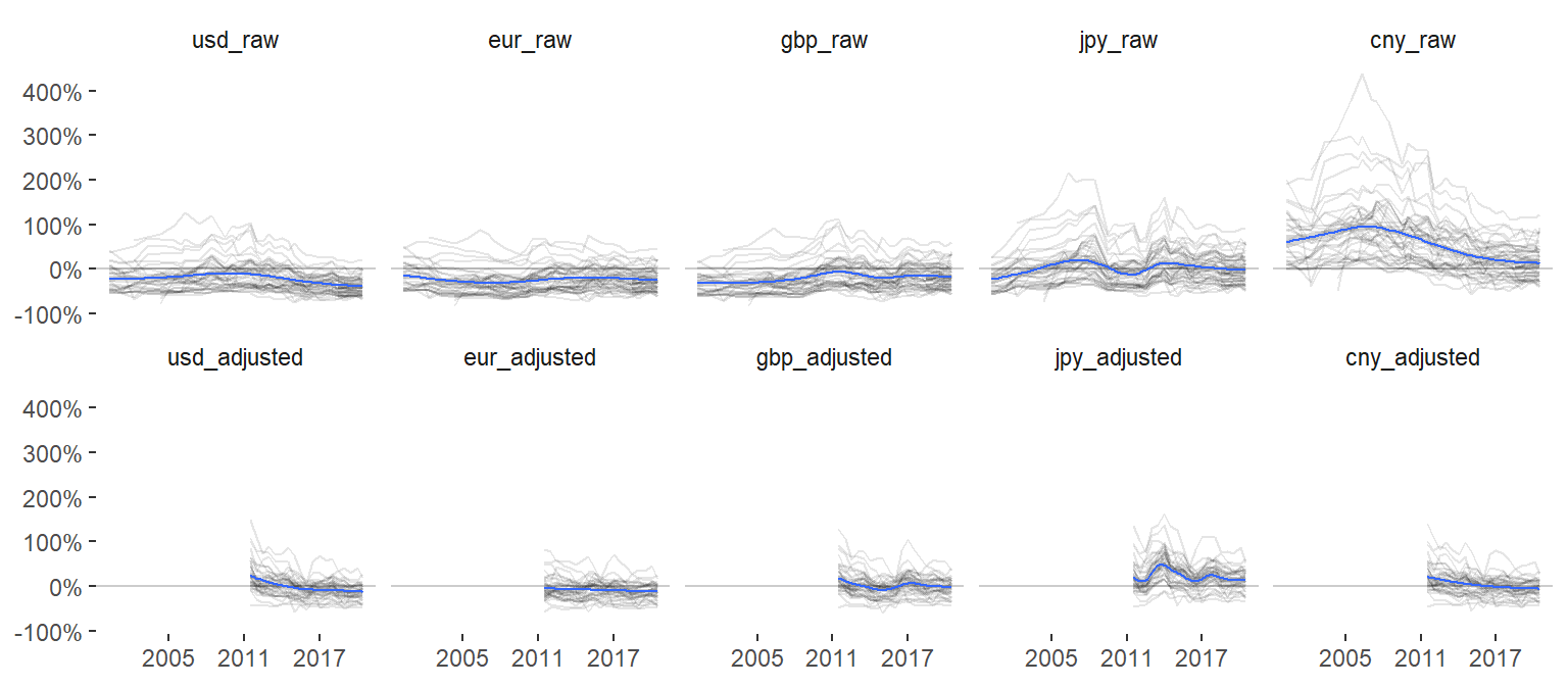
Here, a more interesting trend emerges where we see large differences between currencies. Most other currencies are over-valued compared to CNY, but similar to the other currencies they all tend to normalize in later years.
Lollipop chart
Now create the lollipop chart for July 2020 for all countries.
data_tt %>%
  filter(date == "2020-07-01") %>%
  mutate(value = if_else(usd_raw < 0, true = "under-valued", false = "over-valued")) %>%

  ggplot(aes(fct_reorder(name, usd_raw), usd_raw, color = value)) +

  geom_hline(yintercept = 0, color = "grey80") +
  geom_segment(aes(xend = name, yend = 0), color = "grey80") +
  geom_point() +
  geom_text(data = . %>% filter(name != "United States"),
            aes(y = usd_raw + 0.06 * sign(usd_raw), label = iso_a3),
            color = "grey40", size = 2.2, angle = 90) +

  scale_color_manual(values = col_values) +
  scale_y_continuous(labels = scales::percent_format()) +

  theme_classic() +
  theme(legend.position = "none",
        axis.line = element_blank(),
        axis.text.x = element_blank(),
        axis.ticks.x = element_blank()) +

  labs(x = NULL, y = NULL)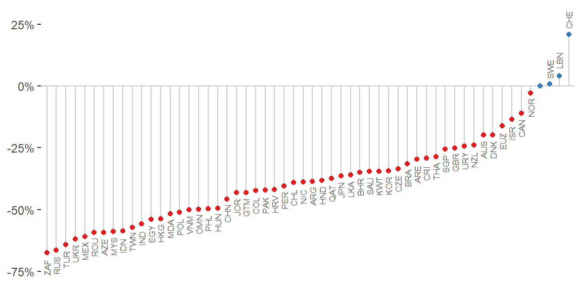
This plot could be extended to 1) other data points (2007, 2011, etc), 2) other base currencies (Euro, British pounds, etc), or 3) GDP-adjusted values (for a limited range). The Economist application let’s the user switch between these parts of the data easily.
Sina plot
Let’s instead create that as a sina plot with ggforce::geom_sina.
data_tt %>%
  filter(date == "2020-07-01") %>%
  pivot_longer(c(ends_with("_raw"), ends_with("_adjusted")), names_to = "raw_adjusted", values_to = "index") %>%
  mutate(value = if_else(index < 0, true = "under-valued", false = "over-valued")) %>%
  separate(raw_adjusted, into = c("comparison", "raw_adjusted"), sep = "_") %>%
  mutate(comparison = str_to_upper(comparison),
         raw_adjusted = str_to_title(raw_adjusted)) %>%

  ggplot(aes(fct_rev(fct_inorder(comparison)), index)) +

  geom_hline(yintercept = 0, color = "grey80") +
  geom_violin(color = "grey60", linetype = "dashed") +
  ggforce::geom_sina(aes(fill = raw_adjusted),
                     shape = 21,
                     color = "white",
                     # fill = "grey80",
                     size = 3) +
  geom_point(data = . %>% filter(name == "Norway"),
             shape = 21, color = "white", fill = "blue", size = 3) +
  ggrepel::geom_text_repel(data = . %>% filter(name == "Norway" & comparison == "USD" & raw_adjusted == "Raw"),
                           aes(label = name), size = 3, color = "black") +

  scale_fill_grey(start = 0.7, end = 0.8) +
  scale_y_continuous(labels = scales::percent_format()) +
  coord_flip() +
  facet_grid(rows = vars(fct_inorder(raw_adjusted))) +

  theme_classic() +
  theme(legend.position = "none",
        axis.line = element_blank(),
        strip.background = element_blank()) +

  labs(x = NULL, y = NULL)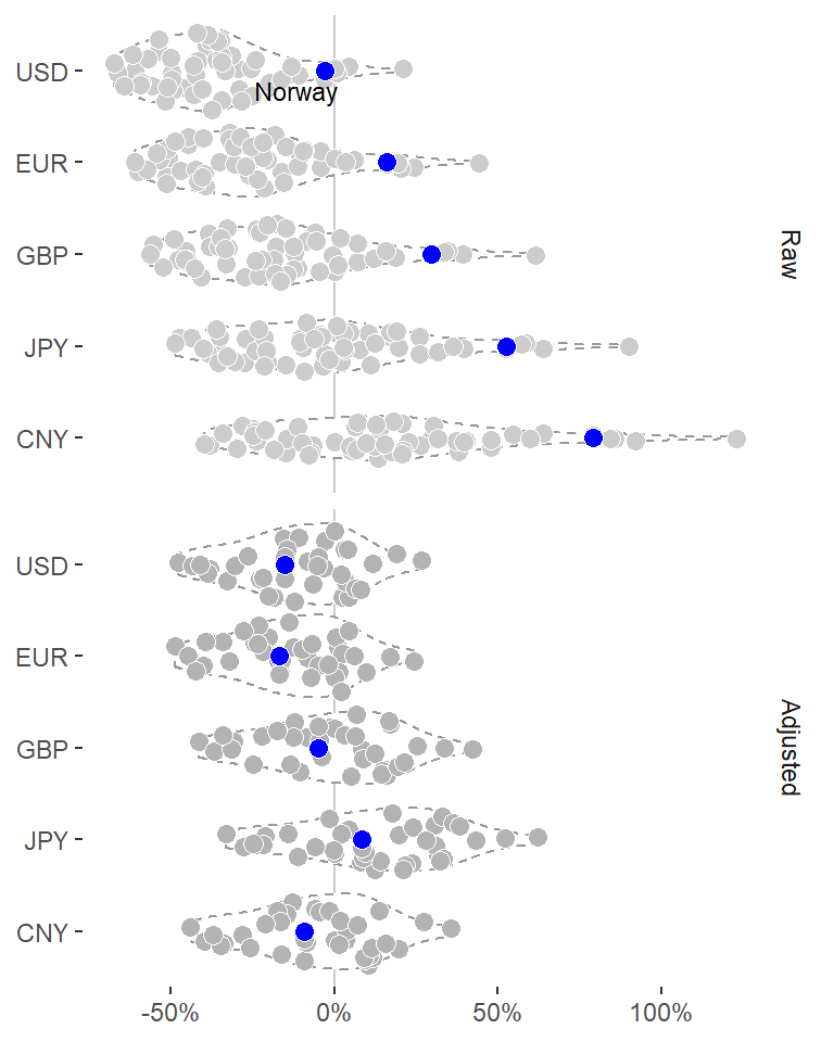
Area under the curve
Look at the Norwegian trend again, but this time using a different geom highlighting the area under the curve (geom_area).
data_tt_norway %>%
  ggplot(aes(date, usd_raw)) +

  geom_hline(yintercept = 0, color = "grey60") +
  geom_area(fill = "grey90") +
  geom_line() +
  geom_point(data = . %>% filter(usd_raw == max(usd_raw)), color = col_values[1]) +
  geom_point(data = . %>% filter(usd_raw == min(usd_raw)), color = col_values[2]) +

  scale_y_continuous(labels = scales::percent_format()) +
  theme_classic() +
  theme(axis.line = element_blank()) +
  labs(x = NULL, y = NULL)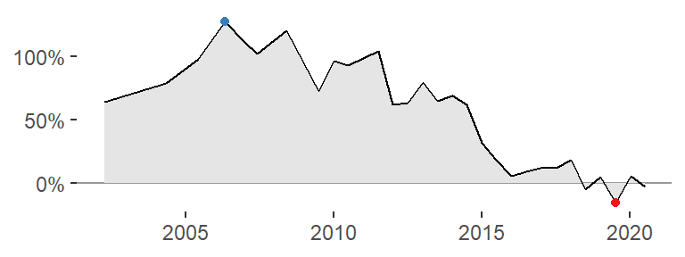
A plot like this could be very nice for an HTML table, such as that displayed in the Economist application. Try to do the same with different fill colors.
data_tt_norway %>%
  mutate(value = if_else(usd_raw < 0, true = "under-valued", false = "over-valued")) %>%

  ggplot(aes(date, usd_raw)) +

  geom_hline(yintercept = 0, color = "grey60") +
  geom_area(aes(fill = value)) +
  geom_line() +

  scale_fill_manual(values = col_values) +
  scale_y_continuous(labels = scales::percent_format()) +
  theme_classic() +
  theme(legend.position = "none",
        axis.line = element_blank()) +
  labs(x = NULL, y = NULL)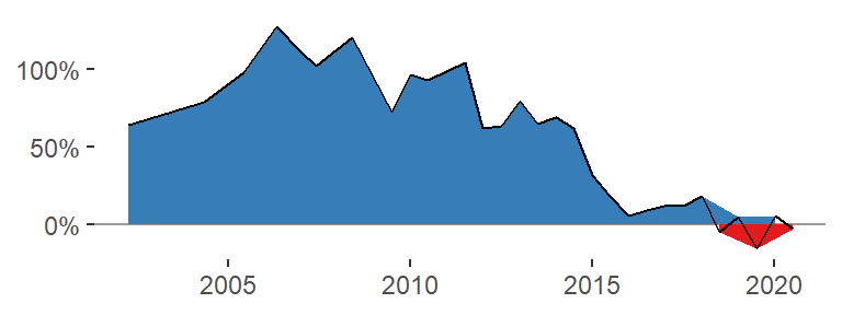
We see a problem with this strategy: the fill color changes the grouping of the points so that there are multiple lines drawn, one for those points above zero and one for those below. I tried a number of different solutions to this issue but none resolved the problem.
It seems I need to interpolate new points approximately where the line crosses y = 0. How to do that? Here is one solution, and here is another.
Let’s try it out (in slightly modified form from the Stackoverflow Q&A):
# Example data
d <- data.frame(
  x = 1:6,
  y = c(-1, 2, 1, 2, -1, 1),
  group = "original"
  )

# Sort by x
d <- d %>% arrange(x)

# Find out where y has crossed zero; that's where the sign has changed from one element to the next
sign_change <- sign(d$y) != lag(sign(d$y))

# Switch "NA" at position 1 for "FALSE"
sign_change <- c(FALSE, sign_change[-1])

# Get the indices for elements that are TRUE
d_indices <- which(sign_change)

# Map over indices and do the interpolation
new_points <- d_indices %>%
  map_dbl(~approx(x = d$y[c(.x - 1, .x)],
                  y = d$x[c(.x - 1, .x)],
                  xout = 0) %>% pluck("y"))

# Add all to a tibble and update original data frame
d <- tibble(x = new_points, y = 0, group = "new") %>%
  bind_rows(d)

# Plot figure as shown in post
d %>%
  ggplot(aes(x, y)) +
  geom_area(data = . %>% filter(y <= 0), fill = "red", alpha = 0.2) +
  geom_area(data = . %>% filter(y >= 0), fill = "blue", alpha = 0.2) +
  geom_point(aes(color = group))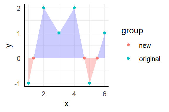
This could be wrapped in a function so that it’s easier to compute for many sets.
interpolate <- function(data, x, y, x_is_date = TRUE) {

  # Sort by x so that x and y coordinates are in the same order as they would be in a plot
  data <- data %>% arrange(x)

  # Find out where y has crossed zero; that's where the sign has changed from one element to the next
  sign_change <- sign(data[[y]]) != lag(sign(data[[y]]))

  # Switch "NA" at position 1 for "FALSE"
  sign_change <- c(FALSE, sign_change[-1])

  # Get the indices for elements that are TRUE
  data_indices <- which(sign_change)

  # Map over indices and do the interpolation
  new_points <- data_indices %>%
    map_dbl(~approx(x = data[[y]][c(.x - 1, .x)],
                    y = data[[x]][c(.x - 1, .x)],
                    xout = 0) %>% pluck("y")
            )

  # If x was a date, change from numeric back to date
  if (x_is_date) new_points <- new_points %>% as.Date(origin = "1970-01-01")

  # Add all to a tibble and update original data frame
  data <- tibble(!!x := new_points, !!y := 0) %>%
    bind_rows(data)

  # Return updated data frame
  data
}
Test function against example data again.
d <- data.frame(
  time = 1:6,
  value = c(-1, 2, 1, 2, -1, 1)
  )

d %>%
  interpolate(x = "time", y = "value", x_is_date = FALSE) %>%
  ggplot(aes(time, value)) +
  geom_area(data = . %>% filter(value <= 0), fill = "red", alpha = 0.2) +
  geom_area(data = . %>% filter(value >= 0), fill = "blue", alpha = 0.2) +
  geom_point()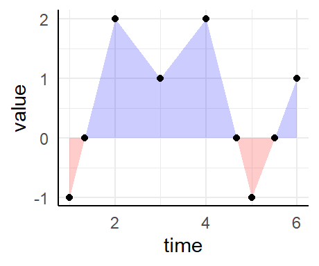
Seems to work fine. And now for the real data.
data_tt_norway %>%
  mutate(value = if_else(usd_raw < 0, true = "under-valued", false = "over-valued")) %>%
  interpolate(x = "date", y = "usd_raw", x_is_date = TRUE) %>%

  ggplot(aes(date, usd_raw)) +
  geom_area(data = . %>% filter(usd_raw <= 0), fill = col_values[2]) +
  geom_area(data = . %>% filter(usd_raw >= 0), fill = col_values[1]) +
  geom_hline(yintercept = 0, color = "grey60") +
  geom_line() +
  geom_point(data = . %>% filter(usd_raw == max(usd_raw)), fill = col_values[1], color = "black", shape = 21, size = 2.5) +
  geom_point(data = . %>% filter(usd_raw == min(usd_raw)), fill = col_values[2], color = "black", shape = 21, size = 2.5) +

  scale_x_date(date_breaks = "3 years", date_labels = "%Y", limits = date_start_end) +
  scale_y_continuous(labels = scales::percent_format()) +
  theme_classic() +
  theme(legend.position = "none",
        axis.line = element_blank(),
        title = element_text(size = 8)) +
  labs(x = NULL, y = NULL, title = "Norway")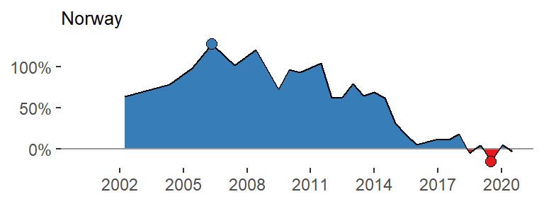
Alright - it works! We don’t need the top and bottom points with the fill color, though. Wrap it all in a function.
area_plot <- function(data, y, country, y_limits = NULL) {

  y_char <- deparse(substitute(y))
  if (is.null(y_limits)) y_limits <- c(min(data[[y_char]], na.rm = TRUE), max(data[[y_char]], na.rm = TRUE))

  data %>%
    interpolate(x = "date", y = y_char, x_is_date = TRUE) %>%

    ggplot(aes(date, {{y}})) +
    geom_area(data = . %>% filter({{y}} <= 0), fill = col_values[2]) +
    geom_area(data = . %>% filter({{y}} >= 0), fill = col_values[1]) +
    geom_hline(yintercept = 0, color = "grey60") +
    geom_line() +

    scale_x_date(date_breaks = "2 years", date_labels = "%Y", limits = date_start_end) +
    scale_y_continuous(labels = scales::percent_format(), limits = y_limits) +
    theme_void() +
    theme(title = element_text(size = 6)) +
    labs(x = NULL, y = NULL, title = country)
}
Test it.
data_tt_norway %>%
  area_plot(y = usd_raw, country = "Norway")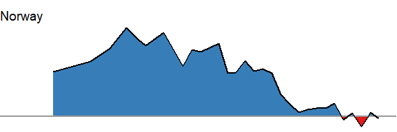
A few countries have rather recent data points only. Let’s highlight only those countries with more than 9 entries.
many_entries <- data_tt %>%
  group_by(name) %>%
  summarize(n = n()) %>%
  filter(n > 9) %>%
  pull(name)
Get the min and max values for all those countries.
y_range <- data_tt %>%
  filter(name %in% many_entries) %>%
  group_by(name) %>%
  summarize(across(usd_raw, list(min = min, max = max), na.rm = TRUE)) %>%
  summarize(min = min(usd_raw_min), max = max(usd_raw_max)) %>%
  unlist()
Now run across (almost) all countries.
all_countries <- data_tt %>%
  filter(name %in% many_entries) %>%
  group_by(name) %>%
  nest() %>%
  mutate(

    # Get the plots
    area_plots = map2(name, data,
                           ~area_plot(.y, y = usd_raw, country = .x, y_limits = y_range)),

    # Use the mean value across time as a facet order
    order = map_dbl(data, ~mean(.x$usd_raw, na.rm = TRUE))
    )
Plot all countries.
all_countries %>%
  filter(name != "United States") %>%
  arrange(desc(order)) %>%
  pull(area_plots) %>%
  wrap_plots(ncol = 7)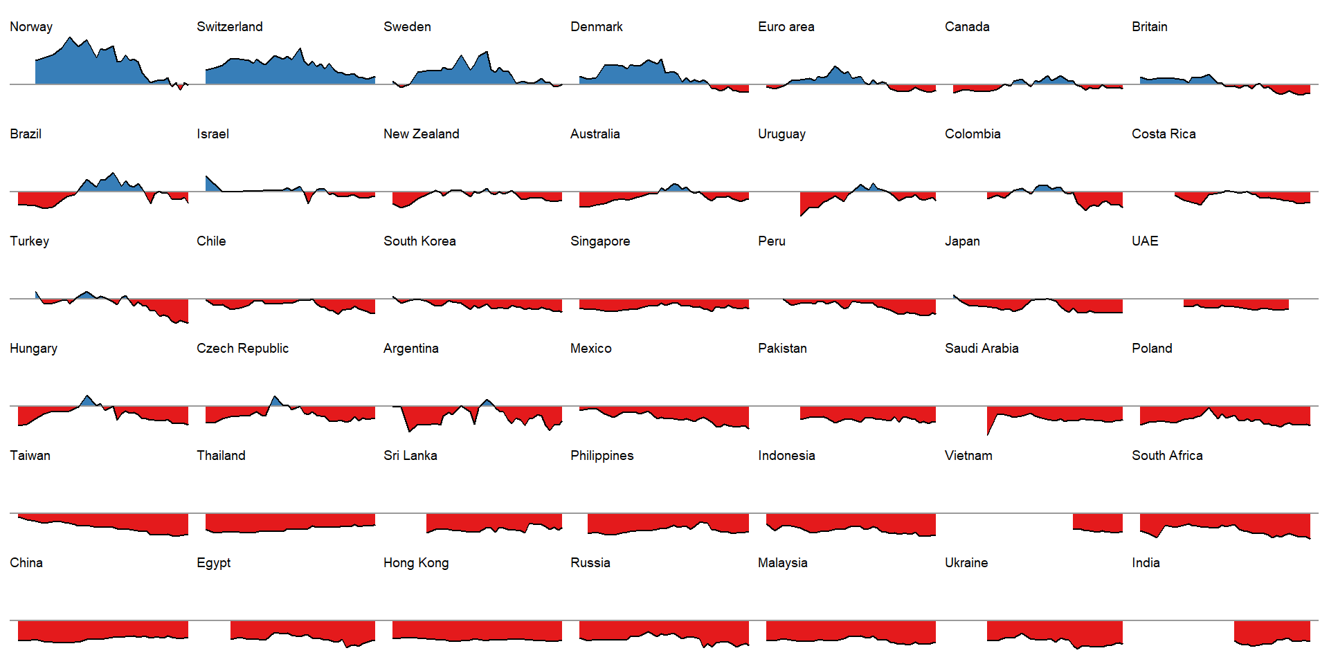
This is a nice illustration! A bit busy right here, of course, but each panel would suite a cell in an HTML table very nicely. Also, ideally we would like to effectively visualize these graphs for all raw and adjusted comparisons (all countries versus USD, EURO, BGP, JPY and CNY), but this way would be slightly complex here.
In summary
In summary, we went through a few illustrations from based on the Economist data set and application.
Jacob J. Christensen
Postdoc in Clinical Nutrition
My research interests include cardiovascular disease, nutrition and data science.